What Guests Notice Before They Read Your Menu
By the time a guest opens your menu, they have already formed an opinion about your restaurant.
They formed it when they saw your exterior sign from the sidewalk. They refined it when they stepped inside and registered the lighting, the materials, the way the space smelled and sounded. They cemented it when a host acknowledged them -- or did not. The menu confirms or contradicts what the space already promised. It rarely changes the impression entirely.
This is why environmental branding matters more than most restaurant owners realize. Your physical space is doing brand work whether you designed it to or not. After twenty years of creative direction for hospitality brands -- restaurants, resorts, casinos, venues -- I can tell you that the gap between what owners think guests evaluate and what guests actually evaluate is one of the most expensive blind spots in the industry. Owners obsess over the food. Guests experience the whole room, in sequence, before a single dish arrives.
This article is about that sequence: what guests read before they read anything, why conflicting signals quietly cap what you can charge, and where to start if you cannot redesign everything at once.
What Do Guests Actually Notice First?
Guests read the environment in a fixed sequence, and every stage happens before the menu: approach, threshold, arrival, and settling.
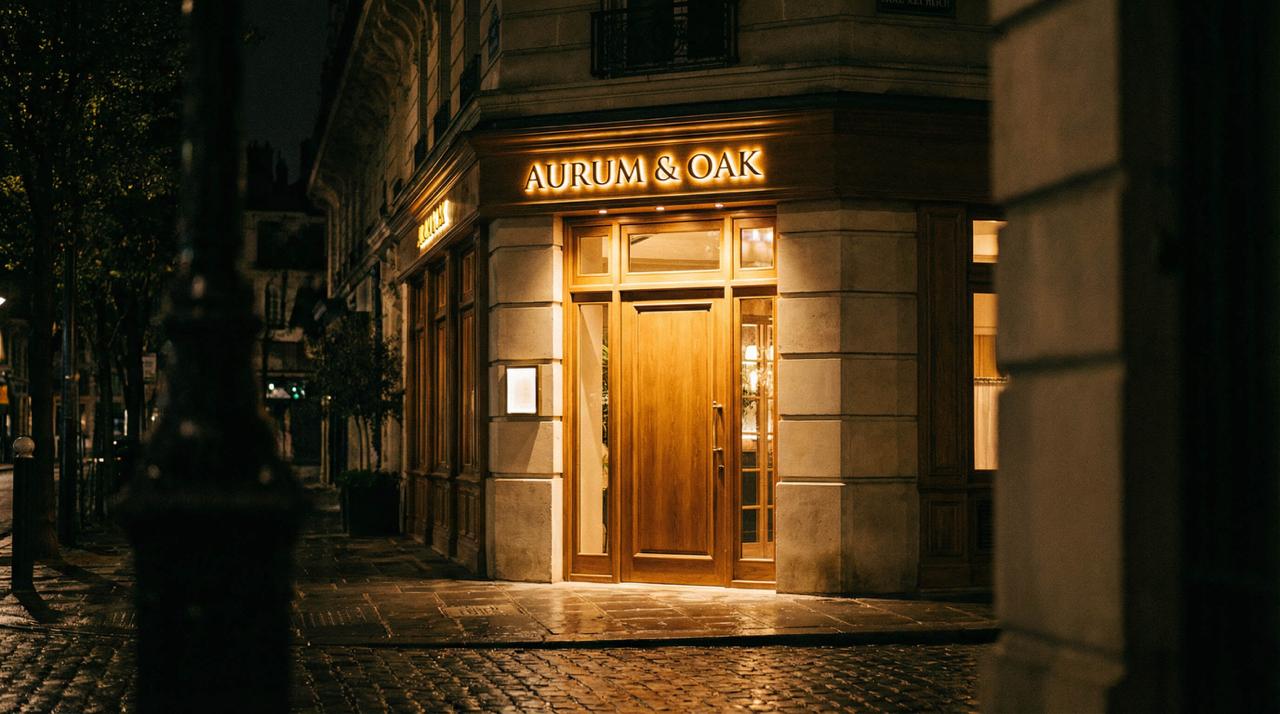
The approach. From across the street or the parking lot, your exterior sign, facade, and lighting have already declared a price point and a personality. Guests calibrate expectations here -- what the meal will cost, how to dress, what kind of evening this is. Get this wrong and everything inside is fighting an impression that was formed outdoors.
The threshold. The door itself, the handle they touch, the first three steps inside. This is the highest-density brand moment in the entire experience: light level, sound, scent, and material quality land simultaneously. Guests describe it later as a feeling -- "it just felt special" or "something was off" -- because it arrived faster than analysis.
The arrival. The host stand, the greeting, the walk to the table. Here the verbal identity joins the visual one. The language your team uses is brand collateral exactly as much as your signage is, and a luxury room with a fast-casual greeting is a contradiction guests register instantly.
The settling. The table itself: surface material, tableware weight, the chair, the light at eye level, the sightlines. This is where the guest's attention finally narrows enough to receive the menu -- with their opinion of you already 80% formed.
There is no neutral anywhere in that sequence. A hand-painted sign on reclaimed wood says something different than backlit acrylic. Exposed concrete says something different than polished marble. A chalkboard menu says something different than a leather-bound one. None of these choices is right or wrong in isolation. They are right or wrong relative to the brand you are building.
Why Do Conflicting Signals Cost You Money?
Because guests price the experience at the level of the weakest signal, not the strongest one.
The problem shows up when the signals disagree: a fine dining menu in a space with fast-casual signage. Luxury price points in a room with forgettable environmental design. A brand that claims "elevated" on its website but reads "chain" in person. These contradictions create friction, and guests feel it as hesitation -- a vague sense that something is off. They may not leave a one-star review over it, but they will not become regulars either. And they will quietly resist the check.
This is the mechanism owners miss: pricing power is built on coherence. A $19 entrée needs no supporting evidence. A $58 entrée is a claim, and every surface in the room is either testifying for it or against it. When the food says $58 and the environment says $28, guests do not average the two -- they trust the cheaper signal, because it feels like the honest one. The result is a restaurant that has to be better than its competitors just to charge the same, which is the definition of a brand working against you. The stakes climb in destination dining markets -- Reno-Tahoe, Scottsdale, the Bay Area -- where guests arrive having eaten in rooms where every signal agreed, and they bring that calibration to your threshold.
The reverse is also true, and it is where the opportunity lives. A room where every signal agrees -- signage, materials, menu, language, lighting -- produces the feeling guests describe as "worth it" before they have tasted anything. Coherence is not decoration. It is the pricing argument, made physically.
Which Three Touchpoints Should You Audit First?
If you are not ready for a full rebrand, start with exterior signage, menu design, and wayfinding microcopy. They carry disproportionate weight in guest perception.
1. Exterior signage. This is the first physical expression of your brand most guests encounter, and it sets the tone before they are inside. Audit it honestly: Is the sign consistent with the experience you deliver? Does it stand out on the street or blend into the block? Is the material quality consistent with your price point? Signage is also where under-investment is most visible -- a premium interior behind a bargain sign is a story guests read as "inconsistent," which they translate as "risky."
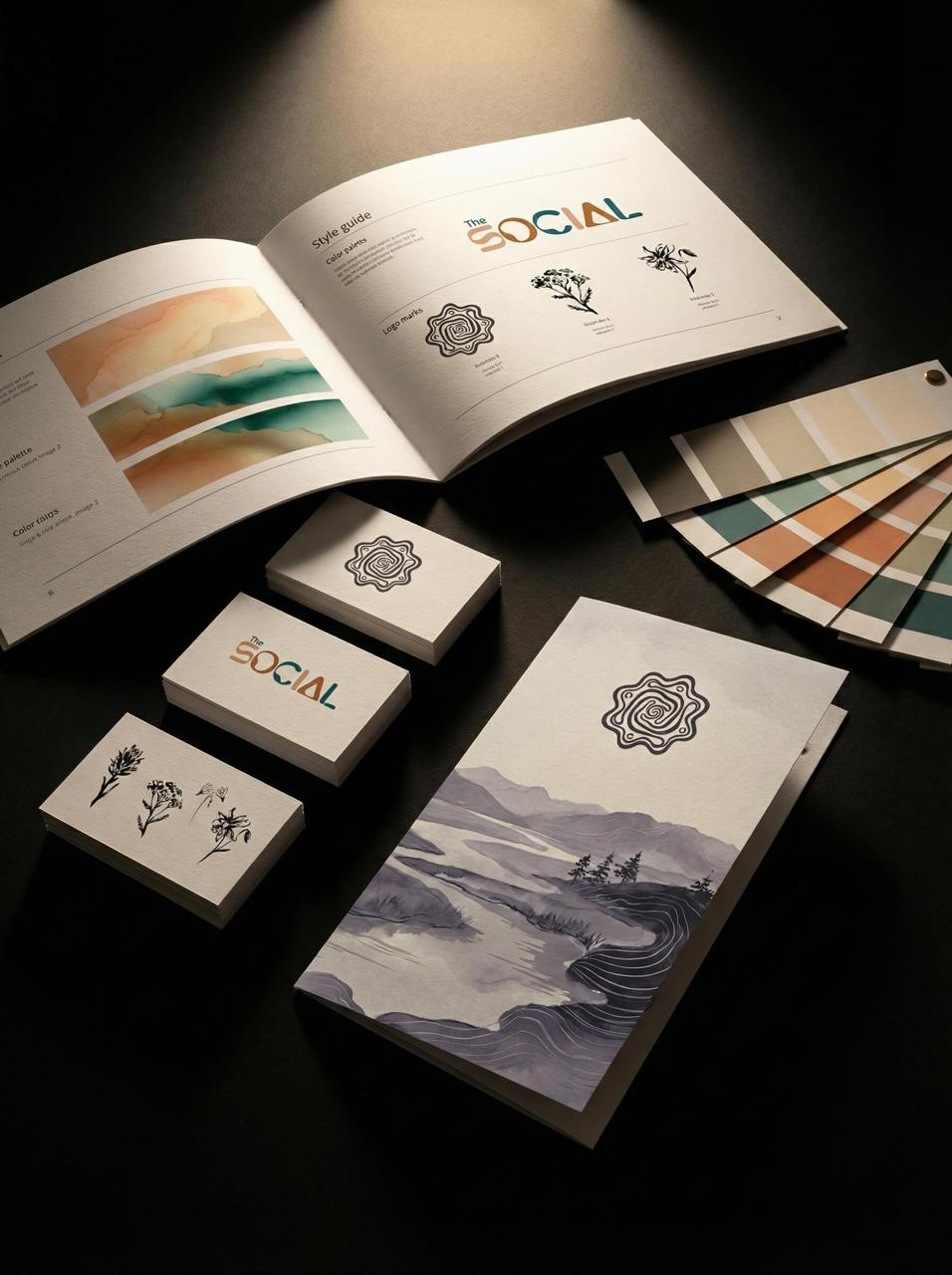
2. Menu design. Not just what is on it -- how it feels. Paper weight, typography, layout clarity, descriptive language. Your menu is the one piece of brand collateral every guest handles, often for several minutes, at the exact moment they decide how much to spend. It should be one of your most considered design assets, and at most restaurants it is the least. The typography of your menu is doing pricing work: crowded layouts and default fonts read as discount signals no matter what the kitchen produces.
3. Wayfinding and microcopy. Restroom signs, table numbers, receipt language, takeout packaging. These small moments are where most brands get lazy -- and where intentional brands pull ahead. Guests may not consciously notice a considered restroom sign, but they absolutely register the cumulative effect: the sense that someone thought about everything. That sense is the luxury signal, full stop. It cannot be faked at the big touchpoints and skipped at the small ones, because the small ones are where guests decide whether the big ones were sincere.
How Do You Design the Full Guest Experience?
Map every touchpoint against the brand strategy before producing anything -- because environmental branding is not decoration, it is the bridge between your positioning and your guest's lived experience.
The best hospitality spaces feel inevitable, like every material, sign, and piece of collateral was chosen by someone who understood the whole picture. That does not happen by accident. It happens when someone sits down with the brand's strategic core -- who it is for, what it promises, what it charges -- and walks the guest journey on paper: approach, threshold, arrival, settling, service, payment, departure. Every touchpoint on that path gets a decision made about it, deliberately, against the same standard.
This is the discipline we bring to hospitality engagements at Made by Plume -- brand systems designed to live in physical space, not just on screens, from identity through environmental graphics and signage. It is also why the strongest projects in our portfolio are the ones where the environmental layer was treated as primary rather than residual: in hospitality, the room is the media plan. My own background spans fine art and fabrication as well as brand strategy -- more on that on our about page -- and it is exactly that combination this category rewards, because the work has to survive being built, lit, and touched, not just presented.
Your space is already telling a story. The only question is whether you wrote it on purpose.
Frequently Asked Questions
What is environmental branding for a restaurant?
Environmental branding is the expression of your brand through physical space: exterior and interior signage, environmental graphics, materials, wayfinding, menus, packaging, and the sensory details of the room. Where a logo identifies the brand, environmental branding is where guests actually experience it -- which makes it the highest-impact and most neglected layer of restaurant brand identity.
How much does it cost to fix a restaurant's environmental branding?
A targeted refresh of the three highest-weight touchpoints -- signage, menus, and wayfinding/microcopy -- can be a focused five-figure engagement. A full brand system with environmental design integrated typically falls in the $15,000 to $75,000+ range from a boutique studio, depending on the scale of the space and the number of touchpoints. Fabrication and installation are additional and vary with materials. The right comparison is against the pricing ceiling an incoherent room imposes on every single check.
Can I improve guest perception without renovating?
Yes -- most of the sequence guests read is graphic and material, not architectural. Signage, menus, lighting adjustments, tableware, packaging, and microcopy can be transformed without touching walls, and together they shift the room's perceived tier substantially. A renovation without brand direction, on the other hand, is the most expensive way to keep the same problem.
How do I know if my restaurant's signals conflict?
Run the outside-in test. Photograph your restaurant the way a first-time guest encounters it -- street view, entry, host stand, table, menu -- and review the sequence cold, ideally alongside the same sequence from two competitors at your target price point. In tourism-driven markets like Tahoe or Scottsdale, benchmark against the rooms your visitors just left, not only the block you sit on. Conflicts are usually obvious within minutes when you see the journey as a sequence instead of living inside it piece by piece. If every image could plausibly come from the same brand at the same price point, you are coherent. If not, you have found the leak.
Guests decide what your restaurant is worth before the first plate arrives. Design for that verdict.
Start a conversation about your brand -- start.madebyplume.com

Denver is a creative director and multidisciplinary artist with two decades of experience building brands for hospitality, entertainment, and lifestyle companies across the West. More about Denver